Business.com aims to help business owners make informed decisions to support and grow their companies. We research and recommend products and services suitable for various business types, investing thousands of hours each year in this process.
As a business, we need to generate revenue to sustain our content. We have financial relationships with some companies we cover, earning commissions when readers purchase from our partners or share information about their needs. These relationships do not dictate our advice and recommendations. Our editorial team independently evaluates and recommends products and services based on their research and expertise. Learn more about our process and partners here.
How to Use Real-Time Financial Dashboards to Make Better Business Decisions
Real-time access to financial data can help you make faster, better decisions for your company.
Business.com earns commissions from some listed providers. Editorial Guidelines.
Table of Contents
This article is sponsored by Xero.
Most business owners run their company by looking in the rear-view mirror. The profit-and-loss statement and balance sheet that land at the end of the month or quarter are accurate, but they describe a moment that has already passed, often by several weeks. By the time the report is reviewed, the window to act on what it reveals has often closed.
Real-time financial dashboards change that relationship with your numbers. Instead of reconstructing last month, they show your cash position, outstanding invoices and expenses as they move, turning accounting from a reporting function into a decision-making tool. This guide covers which metrics deserve a live view, how to read the visual cash flow data a dashboard surfaces and when a signal on the screen should actually prompt you to act.
Did You Know?
In the Federal Reserve’s 2024 Small Business Credit Survey, 51% of small employer firms cited uneven cash flow as a financial challenge—the kind of timing problem a backward-looking report is poorly suited to catch in time.
Why backward-looking reports fall short
Traditional financial statements are built to summarize a closed period. That makes them reliable for taxes, lending and historical analysis, but it also means they are stale the moment you read them. The lag between when something happens in your business and when it appears in a reviewed report is where avoidable problems take root.
Consider how thin the margin for error can be. Analysis from the JPMorgan Chase Institute of 597,000 small businesses found that the median small business held just 27 days of cash buffer, roughly four weeks of runway if inflows stopped. When your cushion is measured in weeks, a problem that surfaces a month late is a problem you may no longer be able to fix.
The result are issues like a cash crunch that could have been seen coming, an overdue receivable that quietly grew while attention was elsewhere or expense creep that compounded for weeks before anyone noticed. Real-time data can prevent this, though, offering business leaders a window into their financial performance on a daily, not monthly, basis.
The core metrics worth watching in real time
Think of these as your dashboard’s vital signs. Knowing each of these metrics today changes a decision in a way that knowing it next month does not.
Metric
What it tells you
Why it belongs on a live view
Cash position
Money in versus money out, and the current balance trajectory.
A month-end snapshot misses the mid-month dip when payroll and rent collide.
Outstanding invoices
Who owes you, how much, and how far past due they are.
Aging receivables are an early warning of a future cash gap you can still prevent.
Upcoming bills
Near-term obligations weighed against available cash.
Lets you sequence payments before an obligation overdraws the account.
Expenses by category
Where the money is going and how that mix shifts over time.
Spending creep is invisible at month-end but obvious as a rising line in real time.
Consolidated bank balances
Total cash on hand across every account in one figure.
Removes the manual reconciliation that makes owners check balances less often than they should.
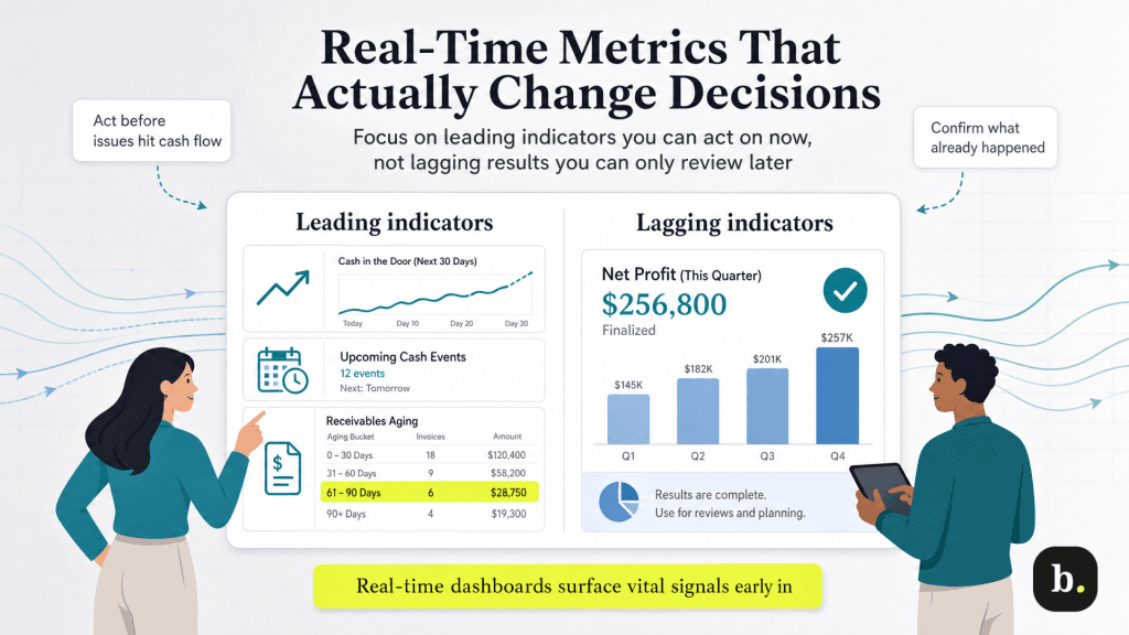
One distinction ties these together: the difference between leading and lagging indicators. Last month’s net profit is a lagging signal that confirms what already happened. Accounts receivable aging past their terms is a leading signal that points to a cash gap that has not arrived yet but is on its way. A real-time dashboard surfaces the leading signals early enough to act on them.
How to read visual cash flow charts
Numbers in a table require you to scan and calculate. The same numbers in a chart let you recognize a pattern at a glance, and pattern recognition is far faster than spreadsheet arithmetic when you are trying to spot a trend before it becomes a problem.
Cash flow trend lines. Watch the direction and the slope. Two lines – money in and money out – that track closely together are healthy. A gap that steadily widens, with outflows pulling away from inflows, is the visual signature of a developing squeeze.
Receivables aging bars. These group what you are owed into buckets: current, 30 days, 60 days, 90 days or more. A growing bar in the older buckets means cash you have technically earned is drifting further out of reach, and it is one of the clearest early indicators of a future shortfall.
Expense breakdowns over time. A category that quietly climbs month over month is easy to miss in a ledger but obvious as a rising slice or line on a chart.
As an illustrative example, Xero’s dashboard brings several of these views onto a single screen, tying cash flow, bank balances, and outstanding invoices together in one visualization. Xero’s short-term cash flow tool projects your balance forward based on bills and invoices already in the system. The point is not the specific layout; it is that a good visualization lets you see the trajectory of your business rather than calculate it.
Bottom Line
A healthy chart shows income and expense lines moving in rough parallel and receivables concentrated in the “current” bucket. Warning patterns look like the opposite: a widening gap between income and expenses, or a steadily growing 60–90 day receivables bucket. The visual makes the shift obvious well before a month-end report would.
When to act on what the data shows
A dashboard is only as useful as the decisions it drives. The goal is to know which movements warrant a response and which are just noise. The pairings below translate common signals into concrete actions.
Receivables aging past your terms. Start follow-up or collections now, before the gap becomes a shortfall. The earlier you act, the more options you have.
A projected cash dip approaching. Delay discretionary spending, draw on a line of credit, or accelerate collections while you still have lead time.
An expense category trending up. Investigate before it becomes locked into your run rate. Recurring costs are far easier to question early than after they feel permanent.
A strong, stable cash buffer. Treat it as an opportunity signal. This may be the moment to invest, hire or negotiate early-payment discounts with suppliers.
A word on cadence: acting on the data does not mean reacting to every fluctuation. Daily cash movements are noisy, and chasing each one is its own kind of mistake. The discipline is to set thresholds of what level of change actually means something for your business and then respond to those, not to the noise around them.
Building a dashboard habit that sticks
A live financial view only works if you look at it, and the most common failure point is not the tool but the habit. A few practices make the difference between a dashboard you check and one you forget.
Set a review rhythm. A consistent daily or weekly glance beats an occasional deep dive. Tie it to something you already do, like reviewing the day’s priorities.
Define your own thresholds. Decide in advance what counts as a signal worth acting on, so you are not re-deciding every time you look.
Customize the view to your business. Surface the metrics that match how your specific business makes and spends money, and set aside the ones that do not.
Friction is what kills the habit, which is why automation matters. When a dashboard is connected to live bank feeds and reconciles transactions automatically (as Xero does through its bank connections) the data stays current without manual effort, and the only thing left for you to do is look.
Tip
Does Xero sound like the accounting software your business needs? Check out our Xero review to learn more about the platform and whether it might be the right fit.
From explaining the past to steering the present
The shift from periodic reports to real-time dashboards is a shift in what your financial data is for. Backward-looking statements explain what already happened. A live dashboard helps you steer what is happening now, catching the early warning while you can still respond and spotting the opportunity while it is still open.
The dashboard itself is a means, not an end. The real goal is faster, better-informed decisions, made with a clear view of where your business actually stands today. A platform like Xero that puts cash flow, invoices and balances on a single live screen makes that visibility foundational rather than optional — and in a business where the median cash cushion is measured in weeks, that head start is worth having.
Adam Uzialko, the accomplished senior editor at Business News Daily, brings a wealth of experience that extends beyond traditional writing and editing roles. With a robust background as co-founder and managing editor of a digital marketing venture, his insights are steeped in the practicalities of small business management.
At business.com, Adam contributes to our digital marketing coverage, providing guidance on everything from measuring campaign ROI to conducting a marketing analysis to using retargeting to boost conversions.
Since 2015, Adam has also meticulously evaluated a myriad of small business solutions, including document management services and email and text message marketing software. His approach is hands-on; he not only tests the products firsthand but also engages in user interviews and direct dialogues with the companies behind them. Adam's expertise spans content strategy, editorial direction and adept team management, ensuring that his work resonates with entrepreneurs navigating the dynamic landscape of online commerce.