Business.com aims to help business owners make informed decisions to support and grow their companies. We research and recommend products and services suitable for various business types, investing thousands of hours each year in this process.
As a business, we need to generate revenue to sustain our content. We have financial relationships with some companies we cover, earning commissions when readers purchase from our partners or share information about their needs. These relationships do not dictate our advice and recommendations. Our editorial team independently evaluates and recommends products and services based on their research and expertise. Learn more about our process and partners here.
How to Transform Your Static Site into a Responsive Website
With consumer reliance on smartphones, your site must be responsive. It's not an option anymore. Here's how to transform a static site.
Business.com earns commissions from some listed providers. Editorial Guidelines.
Table of Contents
A static website looks the same on various devices, meaning the desktop version doesn’t adapt to a mobile device. While a static website typically has great SEO and page load speed, it also has limited functionality and personalization.
A responsive website, on the contrary, ensures the site looks good on every device, which means it will adjust accordingly whether it is viewed on a desktop, smartphone or tablet. This type of site is typically the more attractive option for businesses looking to draw in visitors. Here’s how to transform your static site into a responsive website.
Not sure where to start? Tell us a little more about your business and get customized quotes from qualified providers
What is the difference between static and responsive websites?
Static websites use a fixed and simple HTML code, so they stay the same regardless of what device or screen it is viewed on. A responsive site has a fluid layout that changes to fit any screen, creating a more attractive interface than a static site.
Below are some key differences between static and responsive websites:
Feature
Static website
Responsive website
Layout and design
Fixed layout; stays the same across all devices
Fluid layout; adjusts to fit any screen size
Cost and complexity
Cheaper and easier to create
More expensive and complex than static sites
Content display
Content proportions stay the same regardless of screen size
Maintains content but adjusts proportions to fit any device
Responsive sites are also often confused with dynamic sites, which have fluid web pages that display different content each time. Dynamic sites use web scripting code like JSP, PHP or ASP and tend to load slower than static and responsive sites. Unlike a responsive site — and similar to a static site — dynamic sites’ proportions stay the same across all devices and screens.
Bottom Line
Responsive sites are the most popular site, as responsive web design delivers the best user experience regardless of the desktop, mobile device or tablet used. In today’s highly mobile environment, more business owners create websites with this mobile-first approach.
How the fluid grid revolutionized web design
Since the earliest days of the Internet, web designers have focused on creating sites that function within the contexts of the screens or devices on which they would appear. These contexts have been rather uniform and basic. However, demands have heightened in conjunction with technological advancements. From massive desktop screens and laptops to tablets and smartphones, designers are required to think beyond limited contexts.
More than a decade ago, web designer Ethan Marcotte introduced the concept of the fluid grid. He wrote an article that explored the concept of a design that changed depending on context. In it, he referenced the concept of creating columns of content with widths determined by a percentage of the browser window. As the size of the context changed, so would the size of the content. This would eliminate the need to recreate similar designs for each type of context. Because this fluidity allowed users to view similar content on a page regardless of the device being used, it revolutionized web design. From this concept, responsive websites were born.
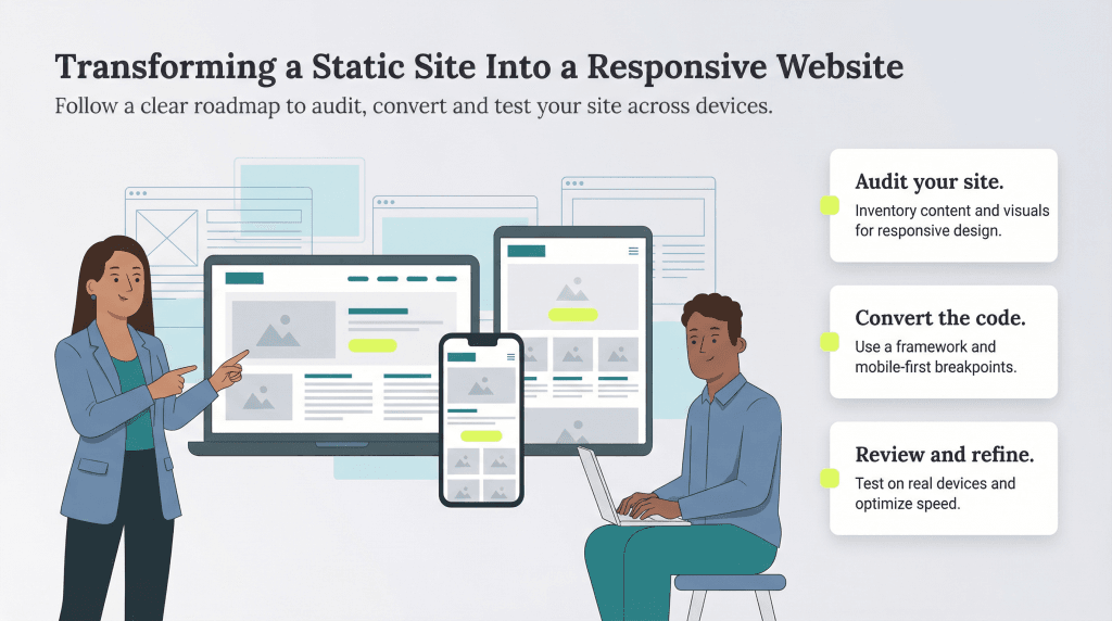
How do you transform a static site into a responsive website?
For site owners like you, this means you no longer have to create a separate site for mobile users. Now, to transition to a responsive design, you must do the following.
1. Audit your website and choose a framework
Before making any changes, thoroughly audit your current website and its content. Pay special attention to visual content, which must be in specific sizes and formats to adapt to a responsive site. “There are a lot of businesses that still have logos that are in low resolution or incorrect formats, images that are incredibly small and written content that’s either sparse or too long,” shared Britton Lorentzen, owner and designer at Empac Design.
Once you’ve conducted your site audit, building a site mockup can help you visualize the changes you need to make. “We create a mockup of the site in Figma … [so] we know what it should look like in both mobile and desktop devices,” said Tyson Heywood, CEO and co-founder of Optima Web Solutions. “Having both of those mockups also allows us to fill in the gaps of what the site should look like on other device sizes, such as tablet views or ultra-wide screens.”
As you can imagine, switching to responsiveness takes a lot of work. Fortunately, frameworks like Twitter Bootstrap and Foundation can do the heavy lifting. Instead of starting from scratch, these frameworks allow you to modify and upgrade your existing site’s code.
2. Convert the code
Once you’ve conducted your audit and chosen a framework, review everything you need to know about converting fixed width. You’ll want to add meta tags such as width=device-width, initial-scale=1 and maximum-scale=1. Additionally, determine your breakpoints that will trigger CSS style rules. The more you identify components suitable for replacement, the easier it will be to convert your site’s code. Take it in bite-sized chunks by moving one page at a time.
Of course, this process will take some time, especially for larger or more complex sites. Kristen Michelle Van Neste, technical project manager/senior front-end developer at Booz Allen Hamilton recommended dividing the work into manageable sections, whether page by page or component by component. “Each element, including pop-ups, navigation menus and interactive forms, needs to be carefully adjusted to ensure it functions seamlessly on all screen sizes,” she explained. “While this process can be time-consuming, it is crucial for delivering a polished final product.”
3. Review your site
Test your converted site on multiple devices to ensure that everything is responding accordingly. Try visiting your site on an iPhone, tablet and other devices with varying screen sizes. Take an especially close look at any pages with video, as embedded videos from sites like YouTube have fixed sizes. If you anticipate users printing your pages, make sure your content is also printer-friendly.
Beyond checking each device type manually, you can use multiple tools to emulate different devices and browsers. Van Neste recommended using Chrome DevTools for quick device emulation and BrowserStack for cross-browser testing.
During your review, monitor your site speed. Tom Jauncey, CEO of Nautilus Marketing, noted that responsive web pages can slow loading times, but the right coding tricks can help mitigate that effect. “It’s amazing how resizing images, compressing files and tweaking code can make a world of difference,” he added.
Though your responsive site may require additional tweaks and optimization to run at its best, the rewards will be well worth the effort. “At the end of the day, it’s about creating a site that makes users say, ‘Wow, this just works,’ no matter what device they’re using,” Jauncey said.
FYI
Transforming your static site into a responsive site will save you time in the long run, especially when it comes to tracking data analytics. This pivot is relatively seamless but can lead to an uptick in site traffic and conversion rates.
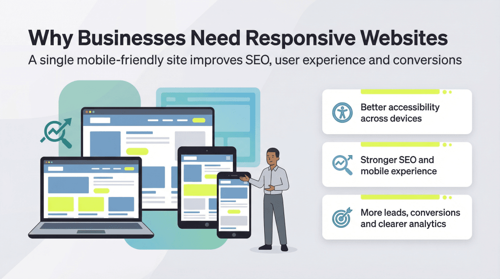
Why should businesses have responsive websites?
Here are some reasons why you should create a responsive website for your business.
They’ve become the standard for accessibility.
Responsive web design has become the standard for businesses across all industries. It’s a requirement for compliance with W3C web standards. “Having a responsive website is essential at this point … so a company website is accessible for all customers, regardless of the device they’re using or method they’re browsing,” said Lorentzen.
They have better SEO.
Because of their mobile- and user-friendliness, responsive websites are prioritized by Google and are ranked higher than those with other web designs. Because many people use their mobile devices for searches, Google prioritizes mobile-first sites in the results. “Since user experience is a factor in how SEO is evaluated, the SEO of a site that isn’t responsive also takes a major hit,” explained Heywood.
Responsive web design also contributes to a more positive user experience, which incentivizes visitors to stay on your website longer. Load speed is also higher and bounce rates are lower for responsive sites. Both of these factors positively affect SEO rankings.
They improve the mobile experience.
There’s nothing worse than visiting a website on your smartphone and experiencing slow loading speeds or distorted images and content. As mentioned above, a responsive website will load more quickly and efficiently on mobile devices than a static site. This is important as many consumers are going mobile and using smartphones and other devices over desktops.
“Having a responsive website is crucial for modern businesses, especially in today’s remote and hybrid working environment,” said Van Neste. “Many users now access websites primarily from their phones, whether they’re networking at a conference, traveling for work or simply multitasking.”
With a mobile-first approach, responsive sites cater to the majority of users, providing proportionate images and attractive displays that are easy to read and scroll through. Related article: Learn By Example: 7 Great, Mobile-Friendly E-Commerce Websites
Tip
If your website is already on a no-code or low-code platform, your task may be even more streamlined. Many website builders, like Squarespace, offer responsive templates and drag-and-drop elements designed to adjust to any screen size.
They attract more leads and conversions.
A responsive website will attract more visitors and generate more conversions due to its professional look and adaptability when accessed on different devices. If your load speed isn’t fast enough, however, visitors are more likely to leave your site without making a purchase.
Dana Jung, founder of Moon Priestess Design posed this hypothetical scenario: Imagine a user visits your site on their phone, but your site is only optimized for desktop, so the aesthetics and functionality are hard to use at best or non-functional at worst. “Even if they want to buy from you, how long will they spend … [until] they give up and go to the next Google search result?” said Jung. “You could have the best product or service in the world and it won’t matter if a prospective customer can’t use your site.”
Additionally, a responsive website ensures visitors have access to exactly what they need without having to navigate various web pages. This will increase and protect your brand’s reputation and credibility, generating more trust in your business.
They provide you with clearer analytics.
Because you have one design across multiple devices, responsive websites allow you to track and measure analytics more easily and accurately. You won’t need to track various user journeys, funnels, conversions and other data across multiple versions of your website. This will help you develop more consolidated reports and data so you can make the proper changes needed to drive even more traffic.
Sean Peek and Drew Hendricks contributed to this article.
Danielle Fallon-O'Leary is a longtime marketer with a passion for helping clients strengthen their online brands. She has managed clients' social media accounts, developed marketing campaigns and compiled key data for analytics reports.
At business.com, Fallon-O'Leary provides guidance on market research, KPIs, survey data and online reputation management.
Over the years, other projects have included newsletter curation, workflow management and search engine optimization. Along with her marketing responsibilities, Fallon-O'Leary has had an up-close look at other aspects of small business operations, including invoicing and accounting, employee recruitment and training.